accessibility
Macromedia Logo Upper Navigation Bar
  Help
Lower Navigation Bar
Products Support Designer Developer Downloads Store International Site Map Company
Home > Designer & Developer Center > Dreamweaver MX Application Development Center
Icon or Spacer Macromedia Dreamweaver MX Application Development Center
Create image-free rollovers
 
The navigation text links on the original law firm page ("About us," "The Partners," "Areas of law," and "Contact us") are easy to spot, but let's make 'em jazzy. How about buttons that appear to roll over but aren't actually buttons or images at all? You can do just that with the magical CSS hover selector:
 
1

Delete the "#navigation a" ID entirely by selecting it in the CSS Styles panel and clicking on the little trash can icon under the scroll bar.

2

Because Drew positioned the navigation ID absolutely, you're going to change the size and positioning to give the buttons better alignment with the content heading. (Absolute, rather than relative, positioning ignores all other elements on the page and positions the item based on the values given. The item is taken out of the "document flow.")

Double-click the #navigation ID in the CSS Styles panel. In the CSS Style Definition dialog box, select the Box category and enter 140 in the Width field (and make sure pixels is selected). Select the Positioning category, change or verify the following: absolute in the Type field, 140 in the Width field (again, making sure pixels is selected). In the Placement area, enter 60 pixels for Left and 140 pixels for Top. Click OK and you're set.

If you'd like to use the space in the navigation area under your buttons for a little piece of news or commentary, place your cursor below the buttons and type in some random filler text. In the Properties box give it "paragraph" formatting. If you've chosen to add text, add the style called "#navigation p", as listed below, to your style sheet. You may either create it by hand in your text editor or click the "+" icon at the bottom of the CSS Styles panel. In the New CSS Style dialog box, name the new style #navigation p, select Use CSS Selector option in the Type area, and define it in master.css. Click OK and entering the following details:

#navigation p {
   margin-bottom: 4px;
   margin-top: 8px;
   font-family: "Lucida Grande", "Trebuchet MS", 
Verdana, Arial, sans-serif;
   font-size: 80%;
   color: #333333;
}
3

Create a selector called .button a using the same method in Step 1 and click OK.

4

In the CSS Style Definition dialog box, set the Font field to "Lucida Grande", "Trebuchet MS", Verdana, Arial, sans-serif (create this list if it doesn't yet exist). Set the Size field to 90% and the Color to #333333 and click none for Decoration.

In the Background category, set the Background Color to #DDDDDD.

In the Box category, set the Width to 100% and deselect the Same for All option under Padding. Instead, set the padding as follows: Top 6 pixels, Bottom 4 pixels, and Left 12 pixels.

In the Border category, leave the Same for All button checked at the top of each field. Set the Style to Solid, Width to 1 pixel, and Color to #333333.

In the Block category, set Display (at the bottom) to block.

These settings make the button the same as the width of the #navigation div, whether it's set to an absolute or relative width and position. The "display: block;" property forces the entire button to be an active link. You specified no text decoration for the button but defined a background color and borders. You gave the button some padding so that the borders stand out from the link—like, well, a button. Feel free to change the wording on the buttons if you like.

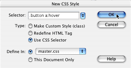
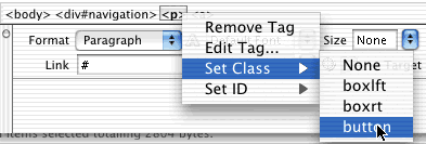
This selector tells the browser that any link with class "button" should be styled as a button.

Here's what this selector should look like in your style sheet:

.button a {
   background-color: #DDDDDD;
   border: 1px solid #333333;
   display: block;
   padding-bottom: 4px;
   padding-left: 12px;
   padding-top: 6px;
   text-decoration: none;
   width: 100%;
   font-family: "Lucida Grande", "Trebuchet MS", 
Verdana, Arial, sans-serif;
   font-size: 90%;
   color: #333333;
}
5

For a little bit of magic, create another class and call it .button a:hover (see Figure 3).

Creating a style class in the New CSS Style dialog box that's defined in master.css
Figure 3. Creating a style class in the New CSS Style dialog box that's defined in master.css

Because we've already shown you many of these properties, we'll only point out what's new. This class inherits all the properties of the one you created just before, so all you have to change are the properties you want to "react" when the mouse hovers over the link. To do this, merely change the settings for the background color and font color. Experiment with this and see what's pleasing to you:

.button a:hover {
   background-color: #666666; 
   border: 1px solid #333333; 
   color: #FFFFFF;
   text-decoration: none 
}

Now attach these styles to your navigation links.

6

View the index.html page in Code view. Remove the <br /> tags after each link. Surround each link individually in <p> </p> tags. Make sure you close your <p> tags so that you're writing valid XHTML code.

In order to apply the style to your links, go to Design view and place your cursor anywhere in the first link (About Us or whatever you've renamed yours to). Look at the tag inspector (status bar), at the bottom of the index.html window. See how the path is shown as "<body><div#navigation><p><a>"? This defines where you are in the page. Control-click "<p>" (right-click "<p>" in Windows). Choose Set Class from the pop-up menu and then choose Button (see Figure 4). Repeat this process for each link.

Assigning a style to a link in Design view
Figure 4. Assigning a style to a link in Design view

This is how the links should appear in Code view when done:

<div id="navigation">
   <p class="button"><a href="#">Who's Simplicity?</a></p>
   <p class="button"><a href="#">What's Simplicity?</a></p>
   <p class="button"><a href="#">Why Simplicity?</a></p>
   <p class="button"><a href="#">Contact Simplicity</a></p>

If you view the links you just styled in Design view in Dreamweaver MX, the underline will go away and the link will have gray over it. (Dreamweaver doesn't actually show all the styling that creates the button; you only see that when viewing the page in a browser.) Preview the index page in your browser and move your mouse over the buttons. They should roll over to a darker gray with white letters if you've styled things properly.

7

Notice how you've filled more of your navigation area since styling the buttons. Does it seem like you're too close to the main text? Fix that now. Either in the Dreamweaver CSS Styles panel or in a text editor make these changes to the #content ID:

padding-left: 280px;
padding-right: 10%;
8

In Design view, change the h1 text in your content area to Simplicity in Design. In your CSS page (using Dreamweaver MX or your text editor), add this property to your "#content h1" ID:

letter-spacing: 0.1em;
9

Move down to the h2 heading in the content area. Change that text to Making it Beautiful and make these changes within your CSS page:

letter-spacing: 0.1em;
font-weight: normal;
10

Add the following in your "#content p" ID:

"text-align: justify;"

This looks best when you have a lot of characters in your paragraphs. Otherwise you'll end up with really spaced-out lines that are particularly unattractive. But it looks especially nice when combined with the next section you'll complete.


Previous Contents Next


©1995-2002 Macromedia, Inc. All rights reserved.
Use of this website signifies your agreement to the Terms of Use.
Privacy | Site Map
| Contact us | Accessibility | Report Piracy